© Mari French 2024
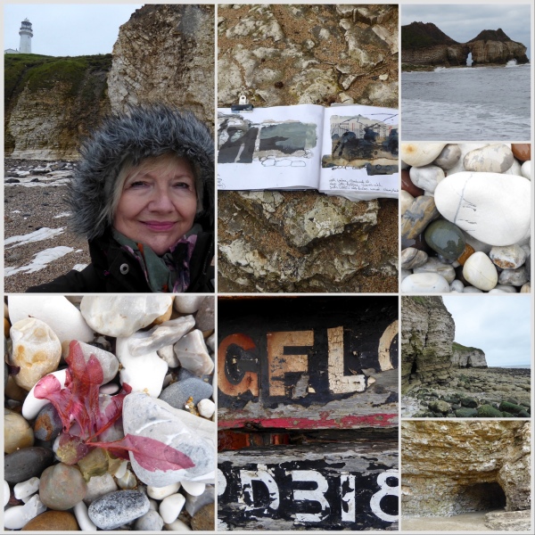
Determined to get away on a much-needed sketching break for new inspiration, I recently headed to the dramatic Flamborough Head on the East Yorkshire coast. I’d only visited once before for a day on a school field trip in the early 1970s, but it left a big impression on me and casting around for new sketching locations this year (it’s a couple of years since I’ve been able to have a solo break just for sketching) and wanting an area within a few hours drive, I decided on Flamborough’s unusual limestone cliffs, caves and geology as a change from my gentler local haunts on Norfolk’s saltmarsh coast.
First impressions …
Due to ongoing family health issues I had to cut my time away short, only managing to get away for two full days. So I was determined to make as much use of the time as possible.
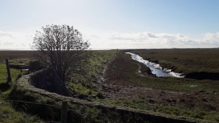
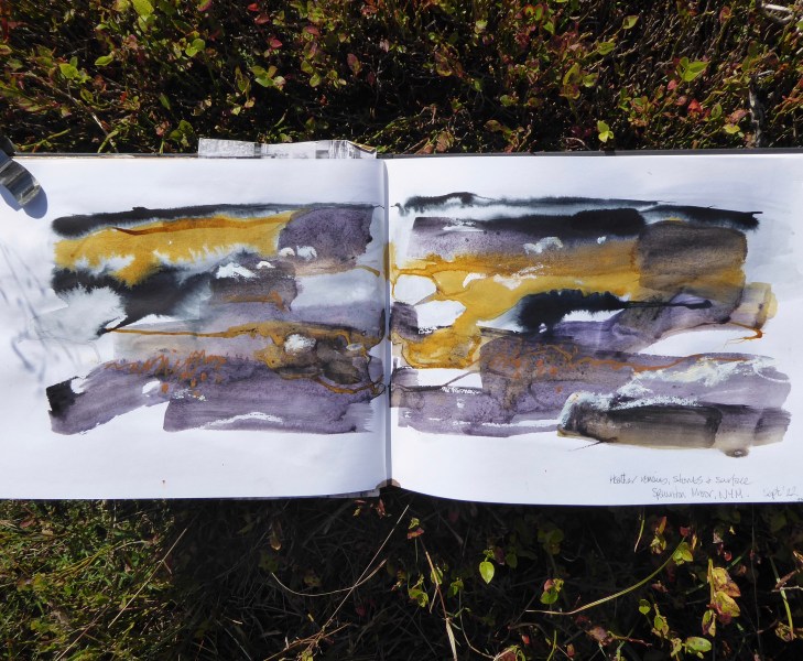
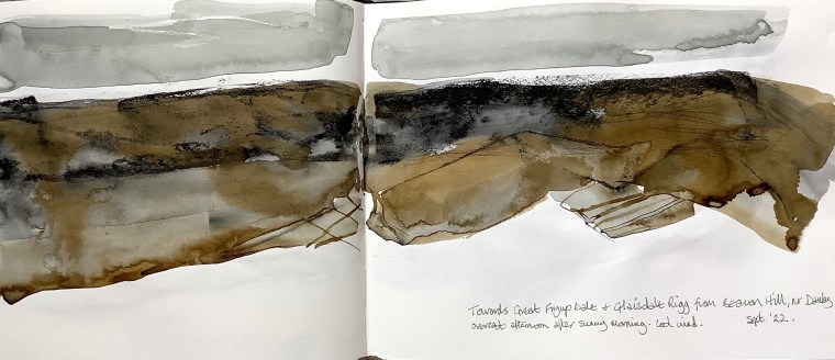
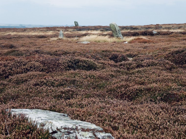
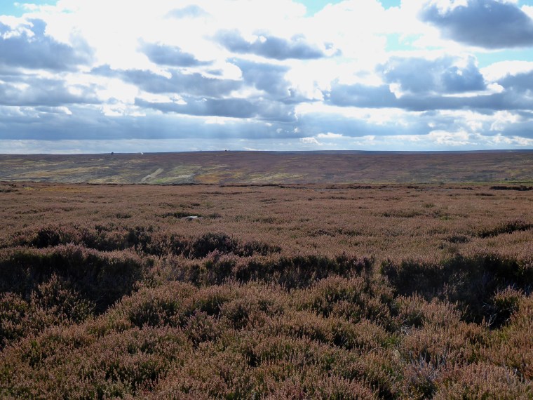
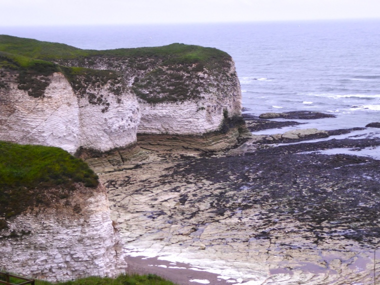
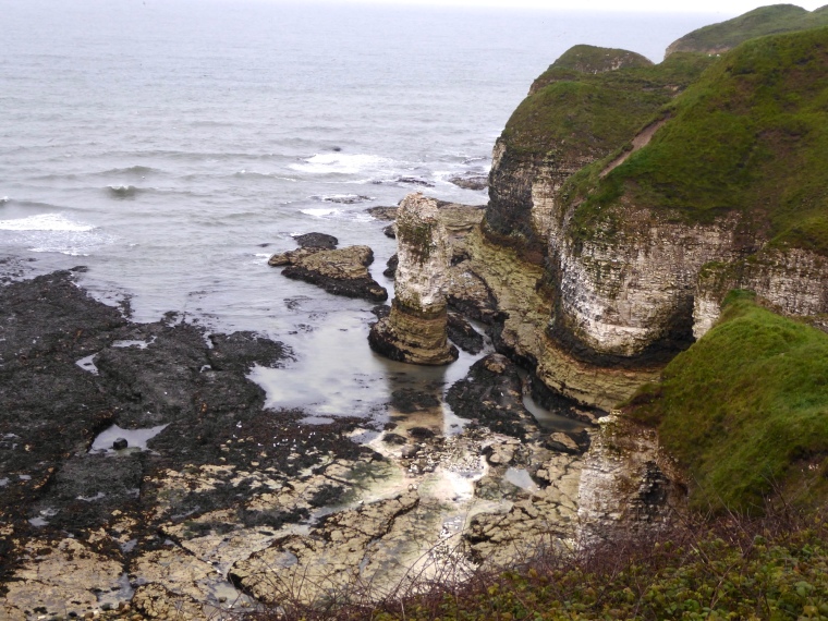
Accessing the many coves far below the cliffs was pretty strenuous, one involved 182 steep steps, but was well worth the effort. Views from the cliff tops are impressive but you need to get down to sea level if you can, to really appreciate the variety of limestone rock formations, multi-coloured sea-worn stones and deep caves; to experience the essence of the place.
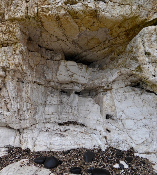
Sketching shelter, limestone ‘grotto’, Selwicks Bay, Flamborough Head.
© Mari French 2024
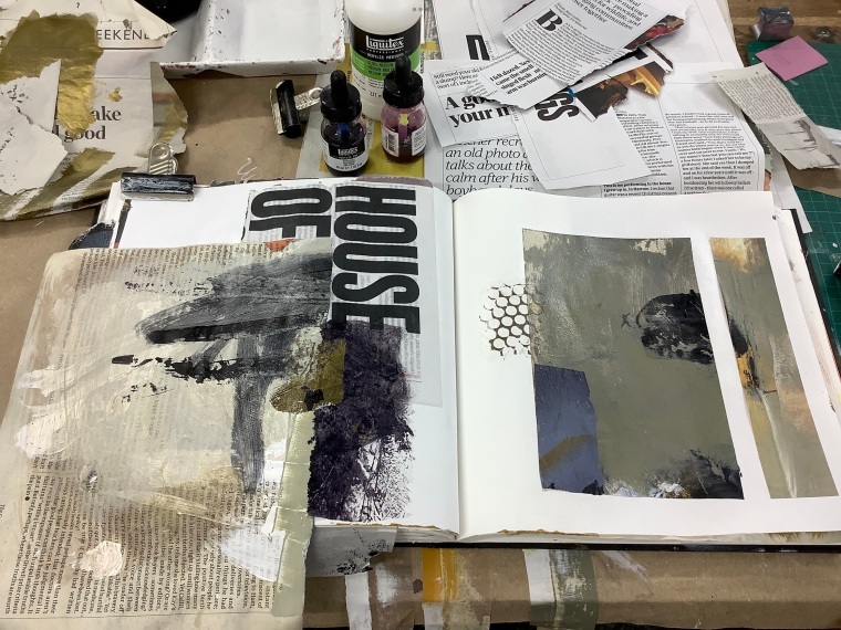
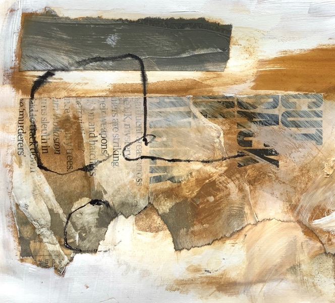
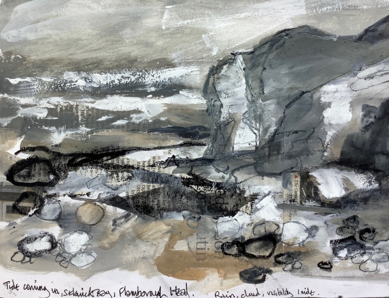
The weather was unseasonably cold and wet for May, with fog followed by sideways rain on the first day, although by the second day it was more changeable. I’d decided beforehand that I wanted to take gouache and collage with me, instead of my usual watercolour or acrylic ink. This soon proved to be a mistake, particularly perched awkwardly sketching in the rain, although a limestone ‘seat’ set back under an overhang was a very useful find. I’d enjoyed practising with the materials in the studio before I went away, and at the kitchen table in the holiday cottage in the evening, but outdoors they were an overworked mess.
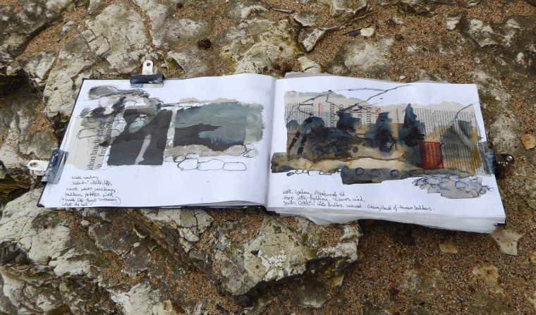
However, as I’ve come to realise over the years, location sketches don’t have to be perfect as they will still capture valuable information and impressions that will feed into your memories when you want to take the subject further back in the studio.
For me, nothing beats the act of sketching outdoors on location to make me observe a subject more thoroughly, even when it turns out like the one below!
© Mari French 2024
Observation & exploration …
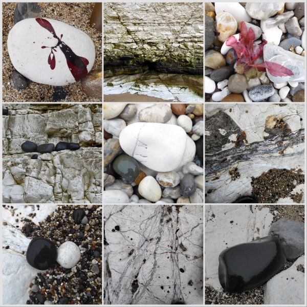
Pebbles, smooth stones and boulders, simple pale colours with veins of quartz and other minerals, strung like jewels in the fissures of rock.
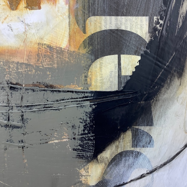
My initial sketches/collages kept emerging as abstracted versions of the coves, bays and cliffs, which I suppose is understandable given their scale and drama and freshness to me. But I can see later work perhaps developing into explorations of the micro landscape that lay beneath my feet: pebbles, smooth stones and boulders, simple pale colours with veins of quartz and other minerals, strung like jewels in the fissures of rock.
Striations and fractures in rock faces and on the foreshore limestone ‘pavements’ meanwhile, will lend themselves to some interesting markmaking.

Taking it forward …
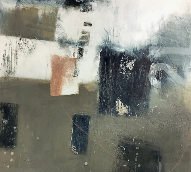
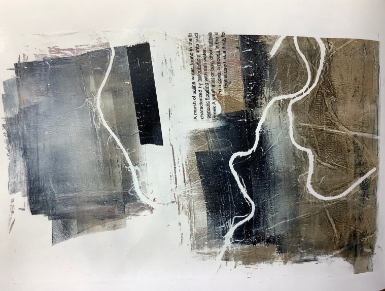
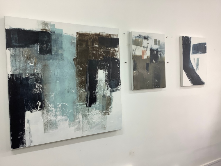
Back home in the studio I’m spending time working on those many impressions. Just now I’m trying out different media and methods till I find a combination that gives the results I want (not sure what they are, but I’ll know it when I see it).
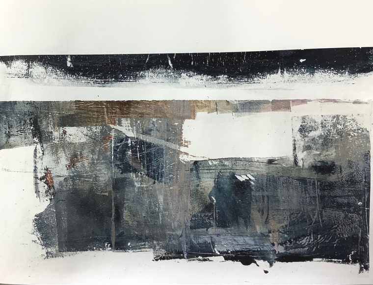
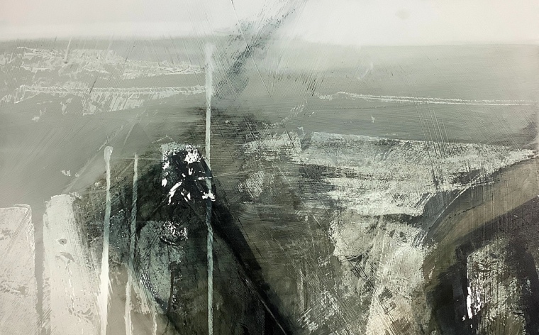
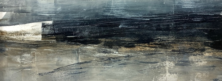
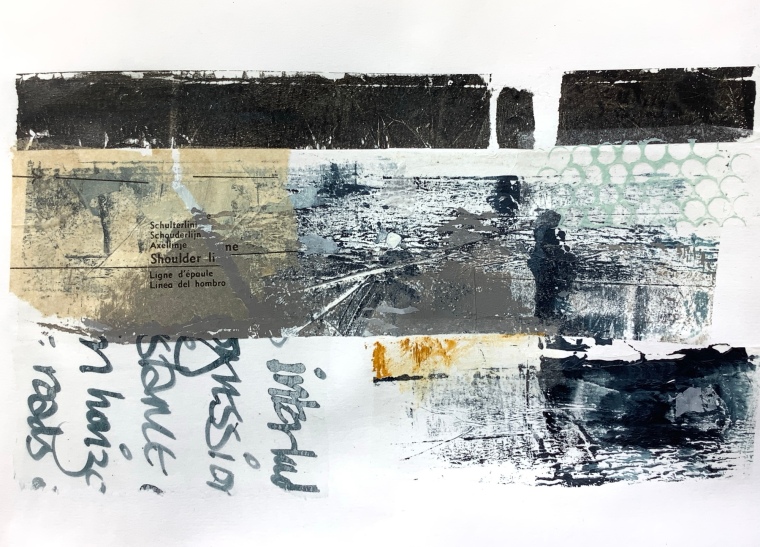
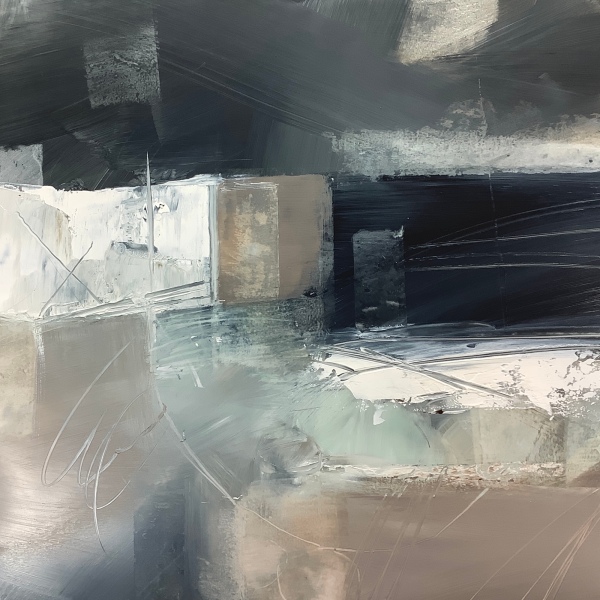
Above, in acrylic paint on Dura-lar, a painting that recalls the moody light and weather of North Landing, Flamborough Head; Dura-lar is similar to drafting film and I love the way acrylic paint behaves on it; the way I can move and blend the paint, and scratch into it. Below, a monoprint in acrylic on tissue, created using a gelli plate.
I just wanted to share a few impressions of the many coves and cliffs around Flamborough Head that I’ve been working on since I returned. I’ll be posting more as I develop the series, on Instagram @marifrench and in a future post in this blog.