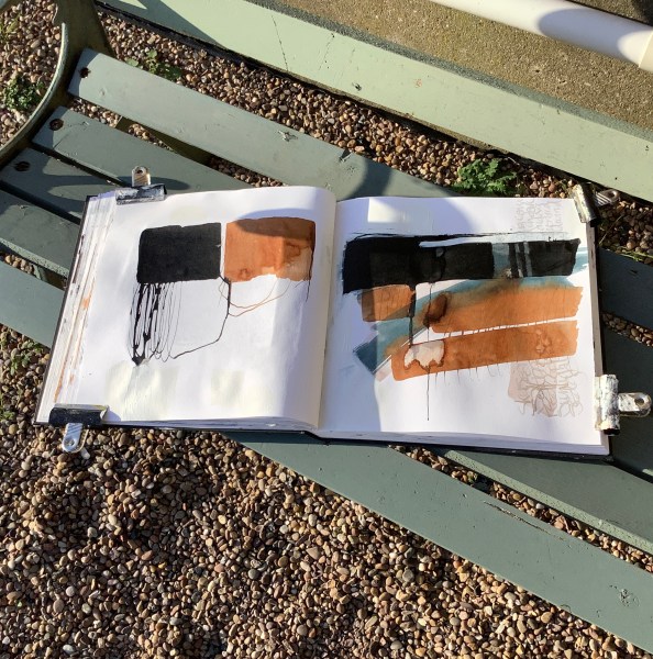
Right now I just love working with acrylic ink on watercolour paper; the medium is perfect for using wet-in-wet, with a dry brush, making marks, or layering translucent areas. I’ve used acrylic ink before as part of mixed media artworks, but lately it’s become the leading player in my painting. It seems particularly suited to my current obsession with the pools and creeks of bright water on the North Norfolk coastal salt marshes.
These are a few of my latest abstract ink works. The limited palette, the washes, bleeds and back runs really appeal to me. I’m trying to capture a sense of the mercurial light on these areas of water on the marshes; mirrors of the sky which fill and empty with the highest tides.

It can be quite meditative building up the layers of ink, the combination of control and serendipity, and I just love the way the ink reacts to the grain of the watercolour paper and the sparkle that results from the brush skipping over the texture.
Although I still add a little collage to the works, I’ve also started to apply calligraphy directly instead of onto tissue paper first as I normally do. The words come from my impressions of the location on the day I’m there, often from my sketchbook notes. Like a meditative chant, they evoke the weather, atmosphere, elements and my thoughts on the landscape that occur while I’m sketching on location.


Below are a couple of larger ink works on paper in a very limited palette, which may be the next stage I’m working towards, or perhaps a valid part of the same series. I’ve altered one of my location photos (above) to show one of my favourite areas of inspiration – Thornham creek and marsh, on the North Norfolk coast, and you can probably see where these last two paintings are coming from.


Some of these works are available on my website www.marifrench.com Do let me know if you are interested. In the meantime let me know if you enjoy working with acrylic ink too.

I continue to be inspired by your beautiful work Mari. Thank you for sharing your reflections, techniques and ideas. Cheers – Lariane
Thank you Lariane, you’re very welcome! Glad you enjoy the posts. Best wishes, Mari.
Thanks Susanna, it’s good to know you enjoyed the post. Yes, you should experiment more with them, it’s so rewarding! As for the paper, a good heavy-ish watercolour paper with a little grain works well for me. I sometimes use granulation medium with the inks too which gives fascinating effects! best wishes, Mari
These are so beautiful – ethereal and translucent – and the inks are so pretty. I use them a little but as yet not in an organised way! I want to experiment more with them. It sounds as if the paper is crucial too.
Susanna
Pingback: where the ink flows … | Mari French : contemporary artworks
Loving this direction Mari, I too love to work in inks, I love the unpredictability of it and combine it with watercolours and maybe a pastel or two😀 what colour is the turquoise blue, I have mainly Daler Rowney fw inks as they are a reasonable price here in Australia. Thank you, love getting your newsletter, always an inspiration
Hi Michelle
Thanks for your great comments on my work and feedback on my newsletter. I can’t remember the exact blue colour I used, but I think it was one of the ‘Magic’ brand of inks. FW inks are good aren’t they? I mainly use Liquitex acrylic inks which are lovely. best wishes, Mari.
Thanks Mari, I look them up
Thanks for sharing Mari. I continue to enjoy your work and processes. Always inspiring. 🙂🌻
Pleased you enjoy the posts Lariane. Thank you.