
Thinking about the use of typography in my abstract landscape painting…
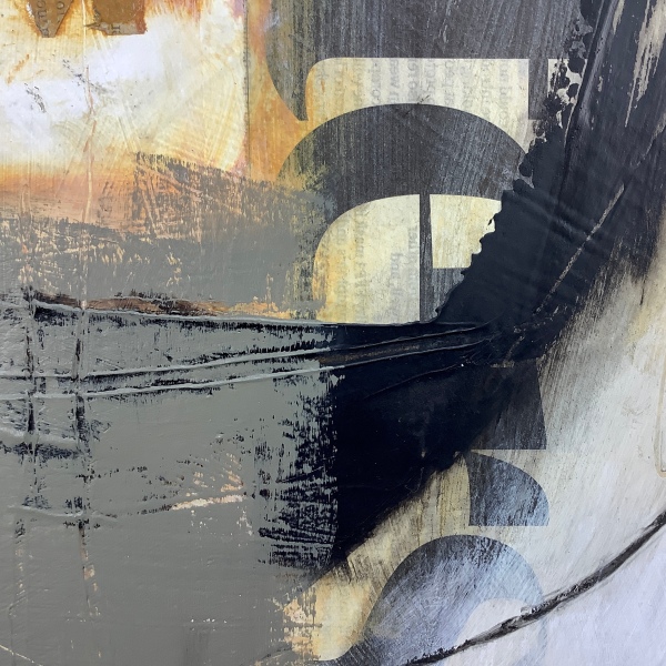
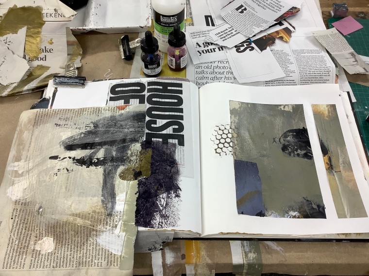
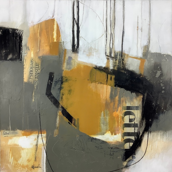
Portions of newsprint and large fonts, calligraphy and scratched lettering – I’m finding it increasingly satisfying to use these in mixed media work. Lately the challenge has been to source larger found type for recent bigger works on canvas, as the contrast in scale is important. Smaller newsprint still works as texture, but large bold lettering adds the impact I need, adding an exciting graphic element, supporting and strengthening the composition and tonal contrast. Fortunately I recently found a suitable source and swooped on it and my work table is now awash with torn out bits of newsprint.
I’ve been drawn to typography since I was a design student at Stockport College in the 1980s. I seemed to have a facility for it and loved using it as a design element in its own right.
However, recently I’ve been considering other possible roles the use of typography might be playing in my recent works; what it may be subliminally evoking:
The dialogue in my head, inner thoughts as I explore the landscape on location, and also as I conjure up my experience and impressions in the studio.
Overheard speech from other people moving through and using the same landscape – walkers, photographers, nature wardens, fishermen, shellfish farmers, etc.
The apparently wild, natural landscapes are corralled by mostly unseen by-laws, ownership and tenancy agreements, environmental legislation governing its use, and more.
The invisible incessant dialogue of phone signals, radio waves, digital information, criss-crossing the air over most landscapes, whether wireless or via masts and telegraph wires.
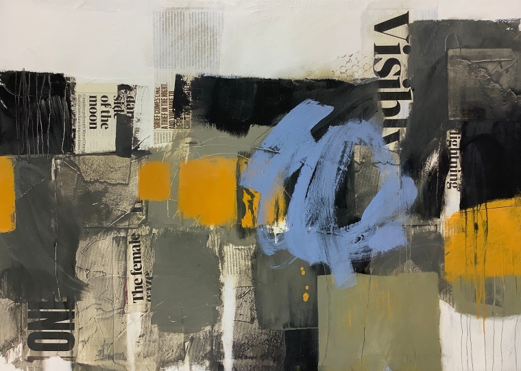
Of course I’m not suggesting the content of the lettering that I use is relevant (apart from calligraphy, the content of which comes direct from my sketchbooks). The choice is random, although I suspect certain portions of text may ring a subtle bell with me, or just intrigue me, when I select it.
The train of thought I wanted to pursue in this post though, is that almost all landscape is affected in this manner by human language and numbers of some kind; a pervasive element in some ways as worth acknowledging as weather and light. The realisation intrigues me and in some ways will continue to inform my work into the future. I’d be interested to hear your thoughts on the subject.

Absolutely…. I recognize the relationship between the land and the typography although I hadn’t deliberately used it in my landscape paintings, only in collage work, but you’ve given me good food for thought. I use road maps with landscape for much the same reasoning. We no longer use printed maps with the gps phone apps as substitute. Maps are covered with words, numbers, signals. Now I’ll add pertinent type to the collaged landscape. Thanks for discussing the idea. Your work greatly appeals to me.
Profound reflection, perhaps subconscious comment on the news stream we are bombarded with on all sides?
Thanks Catherine. Yes, quite possibly, a reaction anyway. Contrasting with the peace of the landscape?
very interesting reflection about how lands and spaces are governed by others and words are flying about constantly in the air space!
Thanks Joyce, it’s always good to get responses to my posts and my odd thoughts! Glad you enjoyed this one.
YW, I’m also struck by the variety of effects Text, letters, symbols can create. I agree, it can show up to express something not seen, as thoughts, feelings, etc.
Interesting observations. I like both works posted but particularly the second one. Can I ask – do you use rollers? Re the lettering – I think when the print is large it forms such a strong part of the structure/composition that it takes a while to see it as lettering, and as you say the small print creates texture. But with the medium size print it makes you (or me at least) want to read it and hence one gets drawn into the writing and then I see the message/information as part of the work, especially if it relates to landscape. I think anyone who is inspired by landscape will care about its story and how it relates to humans. When you said you were trying to find large print I thought immediately of the english tabloids – hopefully you won’t have to resort to them because I really don’t want to read those messages!!!
Thanks for responding Joy, it’s great to hear your thoughts on this post. I like the observation that the larger print almost doesn’t register as text at first. I often try to choose print that chimes with the subject in some way if at all possible. I deliberately avoid any of the trashier ‘newspapers’ – I agree with you on that point! At the moment I’m using the Guardian weekend supplement which has great choice of large texts and try to choose them carefully.