painting with pixels …

I’ve rarely painted domestic interior subjects, but i enjoyed this… the warm glow of the lamp, the loose treatment of the jug and flowers. I may try it with actual paints sometime… 

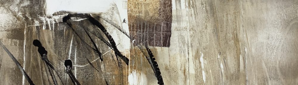
I created these using the iPad app ArtRage. I find ArtRage a really good painting/sketching programme (cheap for iPads but costing more for the comprehensive desktop version). It’s the best painting app I’ve come across so far, with lots of control and choice over materials, tools, colours etc., even the size and type of grain for the work surface. I sometimes use the Sensu brush I recently treated myself to, which adds a new dimension to the experience, but is not necessary, a good stylus will do. 

It took me some time to get used to this painting app – my early efforts were more like schoolkid graffiti until I had chance for some intensive practice back in September while passing time invigilating at my own exhibition in King’s Lynn. (An earlier post shows results from that practice if you’re interested).

Reading_lamp_iPad_sketch_Mari_French_2014.JPG

Reading lamp. iPad sketch. Mari French 2014

To get the effects here I was using a largish flat brush with the with the autoclean option on and instadry option off. I like to play around with various combinations of options and when I get one I like I save it as a preset, so I can use it again. I’m just amazed how pixels can be made to react like wet paint, blending, smudging – love it!

A consideration occurs to me, however, as to how the digital painting will effect my usual ‘physical’ painting/sketching practice. It may (hopefully) free up my brush technique and use of colour for instance… 

or… 

will I find myself reaching for the ‘undo’ option which is so useful on the digital app (as is the layers facility, where various layers can be added to the work in progress and turned on and off at will to view the results). I remember with some amusement, when I worked quite intensively on an Apple Mac as a graphic designer some years ago; I would often find myself, when at home, rearranging furniture or perhaps pictures on a wall and then be mentally grasping for an ‘undo’ for the easy way to set it back as it was!  

hydrangeas. iPad sketch. Mari French 2014.

impressions of Venice …

Palimpsest_Collagraph_Mari_French_2013.JPG

I’ve been busy creating and printing a few more collagraphs this week, in preparation for my forthcoming solo exhibition ‘Beyond the Surface’ in King’s Lynn, Norfolk. Most of the new ones are small and I’ve used a variety of ink colours (Hawthorn Inks).

The plan is to sell the collagraph prints at the show, (which will be a variety of abstracted mixed media paintings), simply wrapped at a reasonable price, so there will be something to suit all pockets.

The recent small collagraphs here were influenced by the crumbling facades of buildings I came across in Venice earlier this year. I used scraps of wallpaper, sandpaper, string, muslin and a lovely piece of narrow lace ribbon I picked up at a recent vintage fair, which seems to lend itself well to the suggestion of fine architectural decoration. It also adds to the fun of browsing vintage fairs and the like, looking for textured materials to use.

By the way, I’m sure I’m not the only one to find the used, cleaned plate as interesting in its own right?

Untitled Collagraph, Mari French 2013

Untitled Collagraph, Mari French 2013

Untitled Collagraph, Mari French 2013

Untitled Collagraph, Mari French 2013

Collagraph plate

Collagraph plate, Mari French


Printmaking_corner_of_my_studio.JPG

The printmaking corner of my studio

evolution of a painting…

I recently came across these digital photos of the creation of a work I have on display at the Burnham Grapevine Gallery in North Norfolk just now. Titled simply ‘Red landscape’ it is approx 40x40cm, acrylic/mixed media on canvas like a lot of my work. I thought it might be interesting to show how the painting evolved.

step1 © Mari French 2009

step1 © Mari French 2009

Obviously step 1 above sees the work some way on in its progress. I started by covering the box canvas with a smooth texture paste that I use, spread liberally and loosely with a palette knife. Before this dried I embedded various materials into it such as fine muslin and string, also pressing pieces of corrugated cardboard (peeling off the covering layer on one side, revealing the ridges) to create interesting areas of texture. Then, using a large (4 inch) soft brush – I applied a mix of burnt sienna and yellow ochre mixed with matt medium all over. When that was almost dry, I swept paynes grey across parts of the upper middle and lower foreground, resulting in the above image (step 1).

step 2 © Mari French 2009

step 2 © Mari French 2009

In step 2 above, the sky area, horizon and foreground are suggested with parchment (a pale cream colour I find a bit gentler than white) giving some definition to what I could now visualise as a fieldscape, albeit an abstracted one. This was allowed to dry thoroughly.

step 3 © Mari French 2009

step 3 © Mari French 2009

Step 3 demonstrates the rather drastic technique I often use of sweeping darker paint over  the canvas with loose strokes concentrating on getting into all those bumps and ridges of texture. Before it dries I wipe most of it away with damp rags (have to be pretty quick here). Although this may seem a waste of time (and paint!) I find it gives a subtle depth to the final painting. Incidentally I use a hairdryer to speed up drying times for most works.

I then warmed up the painting with more burnt sienna and yellow ochre mix, and yellow ochre on its own, used fairly dry so it retained the brush strokes, to indicate ‘field’ areas. The finished work is shown below and also a close-up detail showing how the paint clings to the texture of the muslin etc.

Red landscape © Mari French 2009

Red landscape © Mari French 2009

'Red landscape' detail © Mari French 2009

'Red landscape' detail © Mari French 2009