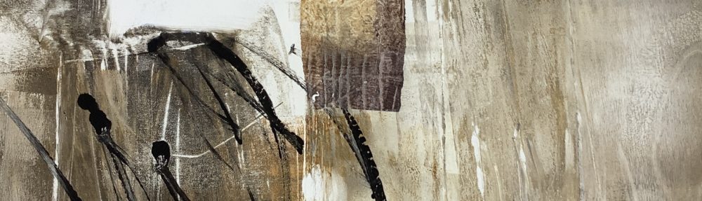

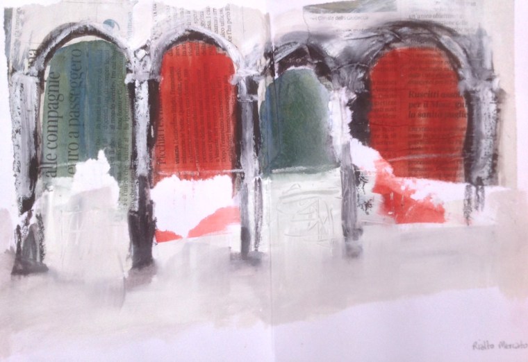
Cannaregio in the heat. Sketchbook spread. © Mari French 2016
I recently spent 2 weeks on holiday in Venice. I’d assumed September would be more temperate, but most days were around 35C (in the 90s Fahrenheit, and I’m crap in hot weather). Unbelievably, I also got painful shingles the very first day. So this could have been one long lament of a post. However… I persevered and did lots of sketching in the second week, mainly among the less celebrated narrow streets (calles) and quiet squares (campos) of Cannaregio and Castello, away from the hordes of tourists and trinket shops.
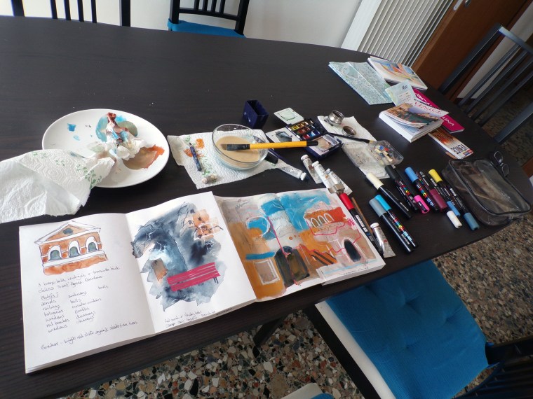
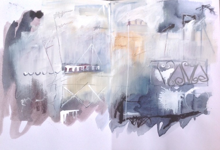
The sketch above (Cannareggio in the heat) is an abstract impression of my first (short) forays into these areas as soon as I felt able. Completed at our apartment dining table in gouache, posca paint pens, oil pastel and inktense block. You can see, by comparing the sketch and the photo below, how I’ve ‘edited’ the image with white gouache etc, leaving parts of the underpainting to show through in places. The thicker gouache paint can then be inscribed into while still wet.
Sketching in the apartment, at rooftop level. © Mari French 2016

Grand Canal from Chiesa Santa Lucia. © Mari French 2016

Venice from Giudecca. © Mari French 2016
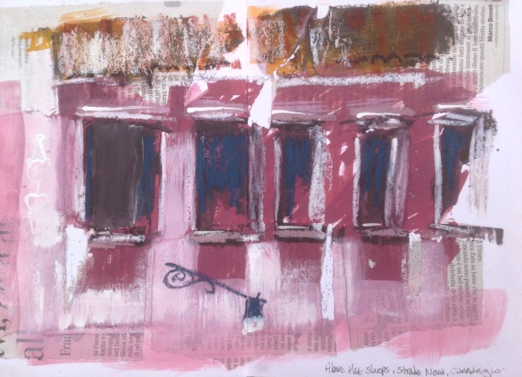
Above the shops. Sketchbook spread. © Mari French 2016
So, this year I made less use of watercolours in my sketchbook and more of gouache, Posca paint pens, oil pastel and inktense pencil. Some of this on top of collaged Venetian newspaper. These gave me a more robust repertoire for evoking the textures of the ancient buildings and to make more use of my recent experimental mark-making in mixed-media. I used a new concertina Seawhite sketchbook which I’d seen used to great effect on the blog of friends’ who’d shared a residency at Brison’s Veor in Cornwall. I have to admit I struggled with it a bit, although I almost always use Seawhite books, but the concertina is a format probably more effective for landscapes, seascapes etc. Having said that, it’s now really useful to be able to spread it out along a shelf in my studio and be able to view my many Venice sketches at once.

Sketching in the Rialto fish market. © Mari French 2016
Rialto fish market, Venice. Sketchbook spread. © Mari French 2016
One of the things I found myself struggling with, was my determination to sketch in an abstract fashion, rather than depicting what was in front of me with too much adherence to detail and representation. This was so hard! I think I managed it in some respects, though. Much easier to achieve when back at the sketching/dining table. Although I think the effort of attempting this actually pushed my on-the-spot sketching further than usual.

Grand Canal, night. © Mari French 2016
Washing, Cannareggio. Sketchbook spread. © Mari French 2016
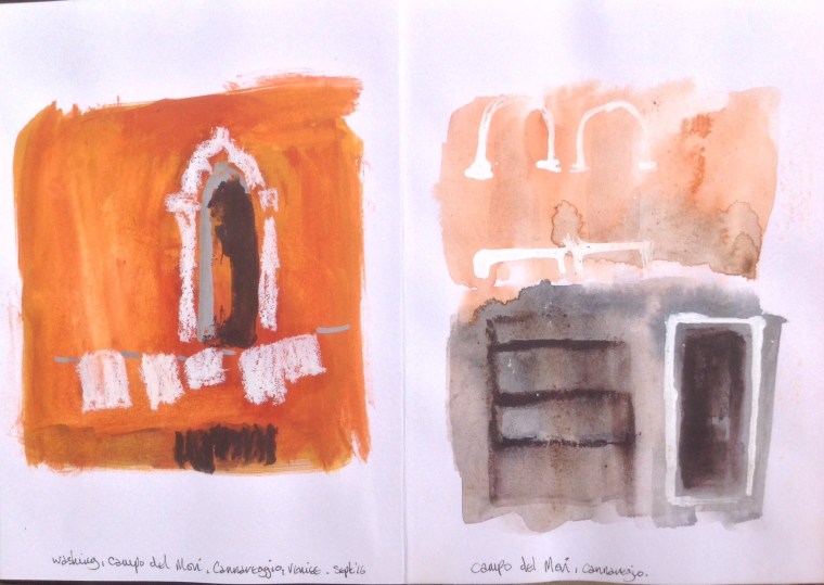
Details, Campo del Mori. Sketchbook spread. © Mari French 2016

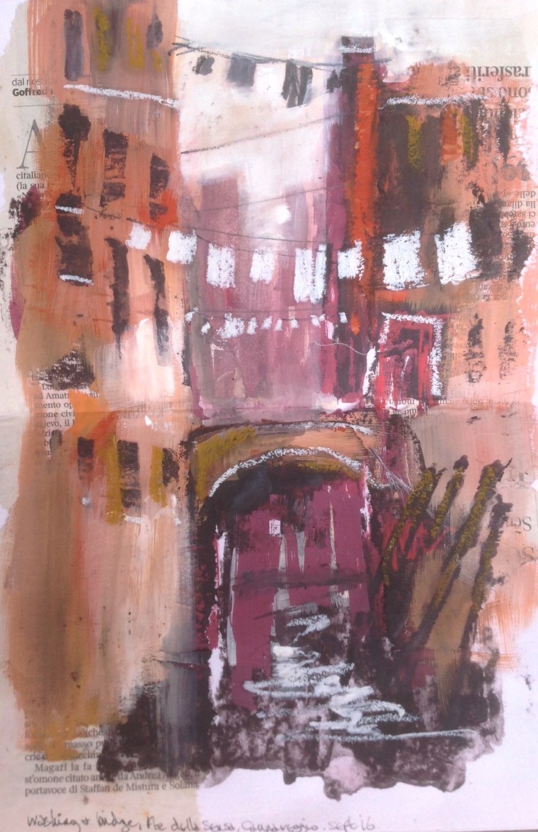
Weathered door, Cannareggio. © Mari French 2016
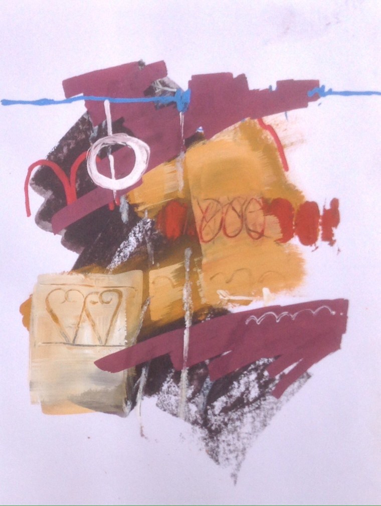
Venetian abstract. Sketchbook spread. © Mari French 2016

Small canal basin, San Polo. © Mari French 2016

Graffitti fish, Dorsoduro. © Mari French 2016
Rooftops abstract. Sketchbook spread. © Mari French 2016
Towards the end of my stay I also discovered a fascination with the huge lagoon, in which Venice nestles like a gemstone among many other islands – some inhabited, some abandoned, some cultivated, some nature reserves – and the saltmarshes, reedbeds and sandbanks.
I’d need more time, with a boat, out there, to do it justice (who knows?). As it was I had to make do with staring avidly from the vaporetto motoring out to Burano and Mazzorbo, and greedily watching from the plane banking over the lagoon on takeoff from Marco Polo airport – the channels, fishing nets, ruined campaniles, boat wakes, bricola, all within the glorious mercurial sun reflecting off the water.

Venetian lagoon, taking off from Marco Polo airport. © Mari French 2016
So here are some of the images and sketches from that two weeks and in the next posts I’ll show you how the experience has evolved so far in my subconscious and emerged in some experimental pieces, abstract photography etc.