winter marsh…

Creek, Thornham saltmarsh.

Creek, Thornham saltmarsh. © Mari French 2016

I read in an anthology this week, one author’s opinion that saltmarshes are one of the bleakest places in winter. Well, although they can be perceived like that in very poor weather, on a jewel of a day like the ones I experienced this week, they can be surprisingly beautiful.

This sketching trip was to one of my usual haunts, Thornham on the north Norfolk coast. It was too cold to sit about for long but I got a couple of rough watercolours done. Sat by the coal barn sketching the small boats on the creek against the sun, I was almost blinded.

Boats on the creek, Thornham. Sketchbook spread © Mari French 2016

Boats on the creek, Thornham. Sketchbook spread © Mari French 2016

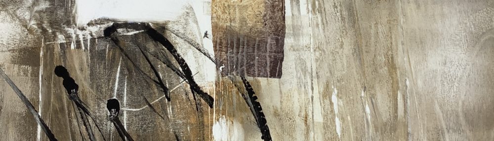
Reedbeds are an important part of the ecology on this coast, as with many such places in Britain. Their soft pewter feathered seedheads ripple like an inland sea. The stems are pale burnished gold in the winter sun and I find them hypnotic. I keep coming back to them recently, both physically, mentally and in my work.

The other motif that keeps catching my eye, are the cradled pools and creeks of azure blue – reflecting the sky but much deeper in colour. They sit like brooches on the bronze brocade of the marsh. I feel the stirrings of an abstracted response to these with simple layered colour and texture.

Reedbeds, Thornham. Sketchbook spread © Mari French 2016

Reedbeds, Thornham. Sketchbook spread © Mari French 2016


Rope and seaweed, staithes, Thornham. © Mari French 2016

Rope and seaweed, staithes, Thornham. © Mari French 2016

 Reedbeds, looking towards Holme from Thornham. © Mari French 2016

Reedbeds, looking towards Holme from Thornham. © Mari French 2016

areas of light …

Progressing the experimental studies on the Norfolk salt marsh areas I’ve been concentrating on recently.  The intention is to create a body of work on this theme eventually. I feel I’m getting somewhere … I’m excited anyway, which is usually a good sign!

Areas of light. © Mari a French 2015

Areas of light. © Mari French 2015

Am still starting with the orange gold colour I’m so obsessed with at the moment, but now adding a few more subtle tones to that limited palette. The one above, Areas of light, is in acrylic, Inktense stick, gouache and newsprint on watercolour board. One for framing eventually I think. The abstract below has a different feel, more of a summer atmosphere perhaps.

Saltmarsh abstract © Mari French 2015

Saltmarsh abstract © Mari French 2015


Workbook spread © Mari French 2015

Workbook spread © Mari French 2015

 And above, another workbook spread on the same theme. I love the golden hues and contrasting dark ink in this.

One thing that bothers me is that each time I write a blog the images look squashed up and I cant figure out why. If they look odd to you, please do me a favour and leave a comment letting me know, thanks.

painting with pixels …

I’ve rarely painted domestic interior subjects, but i enjoyed this… the warm glow of the lamp, the loose treatment of the jug and flowers. I may try it with actual paints sometime… 

I created these using the iPad app ArtRage. I find ArtRage a really good painting/sketching programme (cheap for iPads but costing more for the comprehensive desktop version). It’s the best painting app I’ve come across so far, with lots of control and choice over materials, tools, colours etc., even the size and type of grain for the work surface. I sometimes use the Sensu brush I recently treated myself to, which adds a new dimension to the experience, but is not necessary, a good stylus will do. 

It took me some time to get used to this painting app – my early efforts were more like schoolkid graffiti until I had chance for some intensive practice back in September while passing time invigilating at my own exhibition in King’s Lynn. (An earlier post shows results from that practice if you’re interested).

Reading_lamp_iPad_sketch_Mari_French_2014.JPG

Reading lamp. iPad sketch. Mari French 2014

To get the effects here I was using a largish flat brush with the with the autoclean option on and instadry option off. I like to play around with various combinations of options and when I get one I like I save it as a preset, so I can use it again. I’m just amazed how pixels can be made to react like wet paint, blending, smudging – love it!

A consideration occurs to me, however, as to how the digital painting will effect my usual ‘physical’ painting/sketching practice. It may (hopefully) free up my brush technique and use of colour for instance… 

or… 

will I find myself reaching for the ‘undo’ option which is so useful on the digital app (as is the layers facility, where various layers can be added to the work in progress and turned on and off at will to view the results). I remember with some amusement, when I worked quite intensively on an Apple Mac as a graphic designer some years ago; I would often find myself, when at home, rearranging furniture or perhaps pictures on a wall and then be mentally grasping for an ‘undo’ for the easy way to set it back as it was!  

hydrangeas. iPad sketch. Mari French 2014.