Progressing the experimental studies on the Norfolk salt marsh areas I’ve been concentrating on recently. The intention is to create a body of work on this theme eventually. I feel I’m getting somewhere … I’m excited anyway, which is usually a good sign!

Areas of light. © Mari French 2015
Am still starting with the orange gold colour I’m so obsessed with at the moment, but now adding a few more subtle tones to that limited palette. The one above, Areas of light, is in acrylic, Inktense stick, gouache and newsprint on watercolour board. One for framing eventually I think. The abstract below has a different feel, more of a summer atmosphere perhaps.

Saltmarsh abstract © Mari French 2015

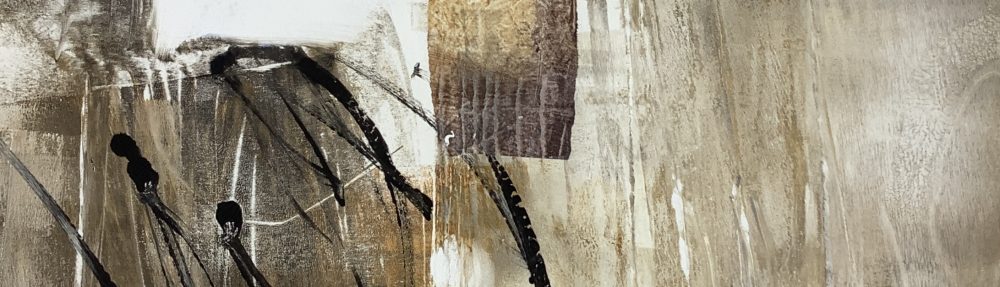
Workbook spread © Mari French 2015
And above, another workbook spread on the same theme. I love the golden hues and contrasting dark ink in this.
One thing that bothers me is that each time I write a blog the images look squashed up and I cant figure out why. If they look odd to you, please do me a favour and leave a comment letting me know, thanks.

You may get my comment twice as WordPress just ate it 😦
I’m thinking that squish is maybe because your images aren’t being placed proportionally?
The forum link also suggests that being ranged left is part of it?
https://wordpress.org/support/topic/all-the-images-are-squashedtoo-close
Anyhoo – it may just be a preview thing?
Quick Specs (all measurements in pixels)
The maximum content width is 585.
The maximum sidebar width is 188.
The header image is 1000 by 288 (width, height).
The maximum width for images on attachment pages is 848.
Love the bottom spread in particular and hope the gallery is doing well x
Thanks Elaine, that’s really helpful. I’ll have a look at that link and the bit about ranging images left – interesting, as that’s what I usually do.
Gallery is fairly quiet, even at Easter, so I’ve got some serious considering to do (other factors too). I’ll email you soon about it.
Hope you’ve both had a nice Easter. xx
Just followed those image guidelines Elaine and it seems to work. The images on this post now look proportionately correct, to me anyway. Thanks so much for the advice, a big help! 🙂