. © Mari French")
Rosewall Hill (detail). © Mari French
… every so often I get the urge to paint hills. I live in Norfolk (not flat, beautifully rolling – well it is where I live) and I love its sweeping beaches and huge skies, but I used to live on the Isle of Skye and I visit Cornwall often, so you can imagine I might enjoy a change in level occasionally. It’s also a change from the more abstract work I’ve been producing lately.
This painting in acrylics and watercolour pastel on deep sided canvas (80×60 cm), is inspired by Rosewall Hill on the Penwith peninsula, Cornwall. Not an accurate representation, I’ll admit, but for me it attempts to capture its looming presence over the moor.
It might not be completely finished yet, but I thought I’d share the progress of the work, step-by-step. Hope you find it interesting.
. © Mari French")
Rosewall Hill (stage 1). © Mari French
I started with a very loose broad brush under-painting in Paynes grey and a mix of Raw Sienna and Titanium white to establish shape and tone (above). As with many of my canvases I prepped it first with a rough coating of texture paste, which I sometimes prefer to a perfectly flat surface.
I deliberately used an unusual colour palette next, of Wedgwood blue, Permanent Rose and a little white, roughly mixed on canvas, to unite the separate areas of the sky and foreground (below). I avoid greens like the plague in my landscapes, in case you hadn’t noticed! They’re too obvious, I prefer colours that create an atmosphere.
. © Mari French")
Rosewall Hill (stage 2). © Mari French
In the process much of the lovely initial under painting is lost, but I’ve learnt not to be too precious about this otherwise I’d end up too nervous to create an effective artwork.
I also had to adjust the shape and position of the hill a couple of times. Before the new purple mix dried I splashed and dropped water here and there, allowing it to run in places, creating pale lines in the paint.
. © Mari French")
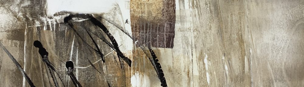
Rosewall Hill (stage 3). © Mari French
Having left the work for a few days I approached it today wanting to lighten it and get some marks and movement in there (below). Much of the violet colour is brushed over with a dryish mix of Yellow oxide and white, quite fast and vigorously, gain mixing on canvas. I then sprayed with water, semi-dried and wiped back in places.
Finally, watercolour pastel (neocolour) in black, was scribbled on loosely, hinting at the rough land forms and distant skyline. To allow for any further over painting acrylic matt medium was carefully applied over the pastel and dried.
Comparing the last two stages, I feel the third stage might have made a finished painting, but I’m still excited by the way the work has developed. I’ll post any further changes if/when I make them.
. © Mari French")
Rosewall Hill (stage 4). © Mari French


