Art at the edge: developments

Dungeness workbook page © Mari French 2018

At last! Having had an enforced break from painting for a few weeks since before Christmas (hope you all had a good one!), my thoughts are turning once again to my most recent source of inspiration – Dungeness. Read my previous post ‘Art at the edge: Dungeness’ for more on how a recent holiday led to my fascination with this unique and strange place.

Dungeness workbook page © Mari French 2018

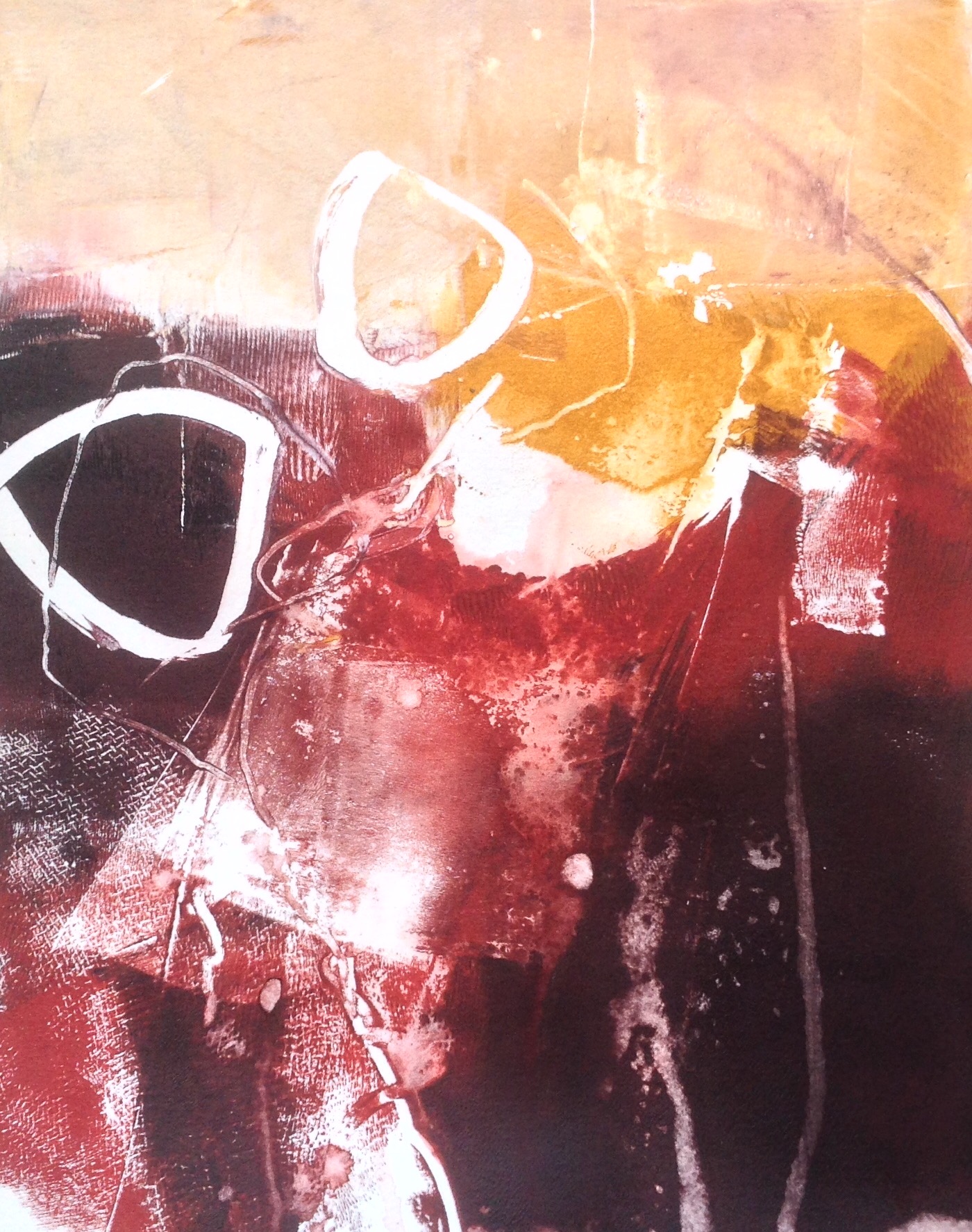
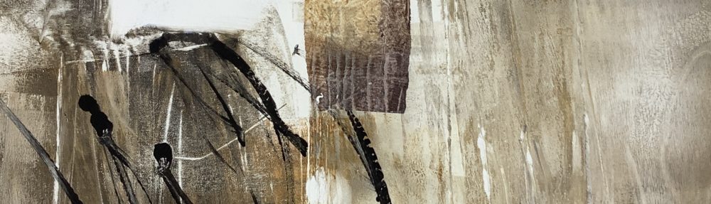
In this post I’m sharing a few recent pages from my current workbook, which I’ve produced since the small paintings in the last post, and I’m working through ideas for a series of mixed media pieces, inspired by my experience of Dungeness, hopefully eventually leading to large canvases. I’m hoping to get back in my studio soon to carry on developing these.

Dungeness workbook page © Mari French 2018Dungeness workbook page © Mari French 2018.
Dungeness workbook page © Mari French 2018

You can perhaps see from these experimental pieces that, as with my other work series, I’m exploring the shapes, linear motifs and colours that the place suggests to me, rather than trying to achieve anything recognisable, so I’m using a lime green for instance, to evoke the weird evening light (not grass!) and to suggest the latent power of the nuclear power station squatting on the edge of the area. I’ve previously used very little green in my artwork, but it feels right here somehow. Linear marks recall power lines, pylons, remains of tracks in the shingle, fences, telegraph poles etc.

Dungeness workbook page © Mari French 2018

In building up the workbook pages shown here, I used torn up pieces of scrap monoprints I’d produced with a gelli plate, while loosening up and playing with colours, textures and ideas. Then layered over with gouache, acrylic, homemade stencils and collage elements till I got the effect I wanted. I keep a box of scrap prints, textured card and assorted materials close to hand for when I’m messing about in the workbook, either incorporating them or using them for impressing or printing shapes. Sometimes it pays to be a hoarder!

monoprinting: a few results…

Monoprint © Mari French 2017

Monoprint © Mari French 2017

Well, here are some of the results of my recent monoprinting on gel plate sessions (as written about in my previous post here). I’m fairly pleased with some of them, not so sure about others, but trying out a completely different process or medium is a great way of shaking you out of an artist’s block or the doldrums or that feeling of ‘what next’. I recommend it!

I soon learnt a few things too…
Printmaking paper may work better than watercolour paper (less size), so I’ve ordered some Somerset smooth white paper;
Open acrylics (Golden) definitely work better (as do Atelier Interactive) as they don’t dry quite so fast. Alternatively I found that adding gloss acrylic medium helped with consistency and slowed down drying time a bit;
Allow lots of time for cleaning up and do it often, acrylics seem to dry particularly quickly on brayers.


I’d still like to produce the soft look of the paint on the gelli plate itself; by the time the image has been transferred to the paper it’s lost that quality. Something worth working on.

After a few days of producing these prints I decided to have a break and go back to painting (acrylics) for a while, and it’s been interesting how the monoprinting has fed back into the new paintings. But more of that in the next post!

getting messy with monoprinting…

Pulling the monoprint © Mari French 2017

Pulling the monoprint © Mari French 2017

I’ve wanted to try monoprinting for some time. The one time I had a go (years back) I was not impressed (excuse the pun) but I think I’d used the wrong type of paper, plate and temperament! A monoprint (or monotype) is a unique print taken from a plate on which ink or (in my case) acrylic paint has been spread with rollers. Marks, textures impressed into the ink/paint and shaped masks (eg. paper) can all be used to create and enhance the final image.

Recently inspired by the beautiful and original monoprints of artist Tonie Rigby I decided to try using a gelli plate. These are very popular at the moment but I’ve not been taken by the proliferation of bright colours and patterns often produced. Gel plates can be a bit tricky to get used to and some artists dislike the texture, but apart from the shape (A4, I prefer square sizes, so may have to cut mine down) I quite liked the slight give of the gel.

Having been stunned by Tonie Rigby’s ‘Urban boxes’ work (see her blog link above), I wondered if I too could achieve something different, a progression of my current painting series maybe. If nothing else it would be interesting and hopefully, fun to try.


Well, today in the studio it was definitely interesting AND fun. I produced over a dozen bits of rubbish before I started loosening up and getting messy, employing more painterly techniques, which is when I work best. I used various acrylic paints and watercolour paper. As with my paintings I wanted to experiment – what would happen if I used this or tried that? …

I must admit I actually liked the look of inked up gel plate itself, perhaps because the transparent surface added another dimension. Today’s work was just the beginning, I’ve just started and have a way to go yet, but I’ll keep at it. Will post more of my monoprinting attempts at a later date.