purple obsession…completed!

…as promised here are the final stages of the tulip painting, described in my previous post.

Below you can see how I added purple to the lower foreground to tie it in with the flowers themselves, knowing I would be painting over most of it, but allowing enough to show through to create depth and interest.

© Mari French 2011

© Mari French 2011

I then brightened the foreground up again loosely with pale green (actually lemon yellow and white), wiping it back in places to allow the lower layer colours to show through. I was after an impression of these wonderful tulips bursting through spring foliage in the May garden, in sunshine.

I next added dioxazine purple and quinacrodrine carmine to the flowers to bring out their colours. I’m grateful to Elaine Phipps, a fellow artist and friend, whose recent description of tulip petals as being like ‘plumage’, is such a brilliantly apt description of them.

© Mari French 2011

© Mari French 2011

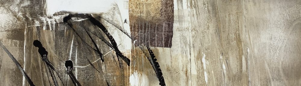
Once thoroughly dry, I covered each bloom with pieces of easily removable self-adhesive brown tape so I could refresh the upper background with a layer of brighter paint – you can see this in the detail image below.  Tearing the tape into small pieces makes it easier to pull and push them into the natural shape of the flowers.

© Mari French 2011

© Mari French 2011

© Mari French 2011

© Mari French 2011

When I was happy with that area I removed the tape – a moment I love as the colours now sing out against the brighter background.

As you can see in the two lower detail photos (which I really wish were actually large final works- how happy would I then be!), I then worked into each bloom with watercolour pastel in shades of light purple and carmine, to bring a liveliness and light to the flowers, giving them more definition.

You can also see where I earlier splashed fine drops of dilute purple paint to enliven part of the work, and again to tie in the rich purple with the background.

© Mari French 2010

© Mari French 2010

The last two images show the finished piece and the work in position at the Norfolk Open Studios group show at South Acre Church near King’s Lynn, a lively and varied exhibition which I spent all day on friday, along with 11 other artists, hanging (more of which in my next post).

© Mari French 2011

© Mari French 2011

South Acre show, Norfolk Open Studios © Mari French 2011

South Acre show, Norfolk Open Studios © Mari French 2011

evolution of a painting…

I recently came across these digital photos of the creation of a work I have on display at the Burnham Grapevine Gallery in North Norfolk just now. Titled simply ‘Red landscape’ it is approx 40x40cm, acrylic/mixed media on canvas like a lot of my work. I thought it might be interesting to show how the painting evolved.

step1 © Mari French 2009

step1 © Mari French 2009

Obviously step 1 above sees the work some way on in its progress. I started by covering the box canvas with a smooth texture paste that I use, spread liberally and loosely with a palette knife. Before this dried I embedded various materials into it such as fine muslin and string, also pressing pieces of corrugated cardboard (peeling off the covering layer on one side, revealing the ridges) to create interesting areas of texture. Then, using a large (4 inch) soft brush – I applied a mix of burnt sienna and yellow ochre mixed with matt medium all over. When that was almost dry, I swept paynes grey across parts of the upper middle and lower foreground, resulting in the above image (step 1).

step 2 © Mari French 2009

step 2 © Mari French 2009

In step 2 above, the sky area, horizon and foreground are suggested with parchment (a pale cream colour I find a bit gentler than white) giving some definition to what I could now visualise as a fieldscape, albeit an abstracted one. This was allowed to dry thoroughly.

step 3 © Mari French 2009

step 3 © Mari French 2009

Step 3 demonstrates the rather drastic technique I often use of sweeping darker paint over  the canvas with loose strokes concentrating on getting into all those bumps and ridges of texture. Before it dries I wipe most of it away with damp rags (have to be pretty quick here). Although this may seem a waste of time (and paint!) I find it gives a subtle depth to the final painting. Incidentally I use a hairdryer to speed up drying times for most works.

I then warmed up the painting with more burnt sienna and yellow ochre mix, and yellow ochre on its own, used fairly dry so it retained the brush strokes, to indicate ‘field’ areas. The finished work is shown below and also a close-up detail showing how the paint clings to the texture of the muslin etc.

Red landscape © Mari French 2009

Red landscape © Mari French 2009

'Red landscape' detail © Mari French 2009

'Red landscape' detail © Mari French 2009

more saltmarsh paintings…and to frame or not to frame?

Bright day, Thornham saltmarsh © Mari French 2011

Bright day, Thornham saltmarsh © Mari French 2011

A couple more from my series of saltmarsh paintings (these are larger than the ones in my previous blog), which seem to be going well just now, building into a series which I’ll have to get framed soon for the group exhibition in May at Halesworth Gallery, Suffolk – Six Abstract Artists. As I’ve mentioned before (and its pretty obvious anyway) some are more abstract than others, so given the theme of the show I’ll have to be selective.

The framer I’ve been using since moving to Norfolk is Bill Henderson of Henderson’s Arts & Framing in Gaywood, King’s Lynn, who I find pretty reasonable price-wise (they also have a good stock of art supplies). Most of my work in the past year has been on box canvas, which I don’t usually frame. A gallery owner reflected in a recent discussion that buyers’ tastes may be swinging towards a preference for american-style ‘float frames’ for canvas – something I’m considering. When I lived and worked from my own studio/gallery on the Isle of Skye most visitors expressed a preference for leaving the canvases as they were – unframed.

Anyway, it’s been refreshing to work on an alternative surface producing these studies of Thornham saltmarsh and creek. I’ve also noticed my colour palette diversifying somewhat from previous more subdued colours I tended to use.

Saltmarsh light © Mari French 2011

Saltmarsh light © Mari French 2011