
Tracey Ross and myself with our work
Last week I travelled down to the Mall Galleries in London for the Private View of the Royal Institute of Painters in Water Colours 2016. This was the first time I’d entered this prestigious annual exhibition and I was fortunate to have had two works selected (‘Liquid light‘ and ‘Winter light‘), both hung in the Main gallery.
The PV was very well-attended with a good buzz about the place and it was great to meet and chat with a few of the RI members, David Parfitt, Roger Dellar, Jean Noble, Rosa Sepple and Anne McCormack, who were all welcoming and enthusiastic and all of whom have work on show. The impressive exhibition fills the Main gallery and three of the side rooms, and is stunning in the diversity and quality of artworks in water-based media on show – from more traditional representational work to contemporary abstracts.
The range of media used was interesting, varying from watercolour, gouache, acrylics and inks often combined with other materials – collage, earth(!) etc. Frances Hatch (photo below) was awarded the Shenzhen International Watercolour Biennial Prize for her large unusual work ‘Ladram Red’ which included Otter Sandstone, Mercia Mudstone, gouache in its makeup.

Busy PV for the RI at the Mall Galleries

Main gallery, RI pv Mall Galleries

Frances Hatch with her prize-winning work ‘Ladram Red’

Visitors studying Jean Noble RI’s vibrant abstracts
I have my own favourite artworks which caught my attention, see further on in this post, but there’s something to suit everyone. The exhibition runs until 16 April, and is well worth catching. I like the way the RI exhibit members’ work alongside that of non-members rather than having them in a separate room. The selection of members’ sketchbooks on display in cases was a welcome touch too.

Liquid light, Mari French 2016.
The following images are a personal selection of the artworks that caught my eye. Most are from the Mall Galleries website, which lists all the selected artists and has a page for each of them. I’ve linked all these images to the relevant page on that site where you can also see the other work the artist has had selected. I’ve also linked artist names to their websites where I could find them (and I’m surprised how few seem to have one). All images are copyright of the individual artists.
‘Autumn Fields’ by Andrew Suddaby, watercolour and acrylic, 23x23cm. An exquisite minimalist small abstract landscape in siennas and ochres.

Autumn Fields, Andrew Suddaby
‘Evening light, Paddy’s Gole’ by Anne Kilvington, water-based media, 60x75cm. This striking work in brooding indigos was one of the prizewinners.

‘Evening light, Paddy’s Gole’, Anne Kilvington
‘Winter hillside’ by Jean Robinson RI, mixed media, 59x50cm. An arresting combination of colours and textures.

‘Winter hillside’ by Jean Robinson RI
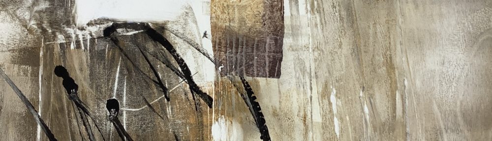
‘Proclaim’ by Tracey Ross, acrylic, 39x39cm. This small haunting landscape really appealed to me. (I’ve used my own photo here as the one on the Mall Galleries webpage seemed a lot paler than the actual work).

‘Proclaim’ by Tracey Ross
‘Garden, Summer’ by Dominique Cameron, watercolour, 52x125cm. A lively burst of exuberant colour and mark-making.
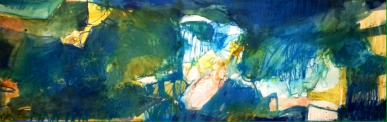
‘Garden, Summer’ by Dominique Cameron


