
Coastlines, abstract 1. Mari French 2014
I’ve been using a lot of blue lately … Prussian, turquoise, aqua… mainly due to painting like mad for an upcoming solo show at Greyfriars Art Space in King’s Lynn, this September.
The exhibition will hinge on the theme of coastlines, namely the rugged and dramatic coast of Cape Cornwall, where I spent an art residency back in March, and the contrasting and more serene (usually!) expanse of beaches and salt marsh that make up the North Norfolk coast, where I often go walking and sketching.
But I hit a creative block last week… couldn’t face more blue seas, not for a while anyway. I was stuck… stalled… needed a jolt to the system. What to do? Actually, what a lot of artists turn to in these circumstances… a change of palette (a change of subject matter is not really an option at the moment and not necessary, I enjoy painting coastal landscape, I just needed a fresh angle).
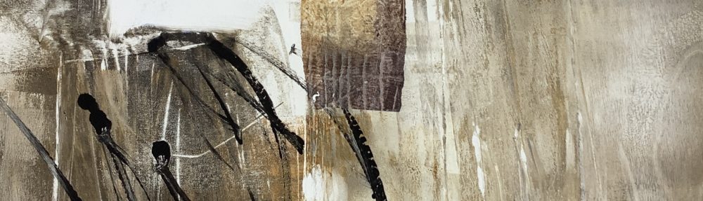
I turned all my recent coastal paintings to the wall, put my usual acrylic tubes out of the way and grabbed Permanent Rose and Cerulean blue (okay, still blue but somehow different when used with pink!) along with a luscious plummy Inktense stick and set to it with abandon on two fresh canvases I’d prepared with texture paste. (as you may know I prefer not to start with a flat surface).
I then needed a contrast, so used a mix of lemon yellow and white, with a touch of Chromium oxide. These are the results, still in progress, I’ve added a few more brush strokes since, but I enjoyed it tremendously. I like the zingy colour contrast and lively lines. In the second canvas (below) I’ve used paynes grey with a brush instead of the Inktense stick.

Coastlines, abstract 2. Mari French 2014
It may seem obvious, but it’s something I have to remind myself of now and then… as artists we don’t have to follow rules, use representative colours, shapes, imagery etc (unless we want to)… we can please ourselves… make it up…
I wish it was as easy as it sounds. I’m learning that it takes practice, and a bit of ‘to hell with it here goes’ to ring the changes. But it’s worth it for the sense of exhilaration produced. I believe it’s important to please ourselves as artists if we want to produce work of integrity and develop our own style.
No doubt I’ll still feel the urge to paint less abstract landscapes/seascapes, but I can’t help wondering if at some point in the near future I’ll be producing work more like these. Either way, this seems like a necessary stage (see last comment below).
And for those interested, below is the painting I was working on before the artworks above. I’m pleased with it, and I know there are plenty of people who will prefer it. But you don’t progress if you don’t experiment/play, right? In fact, if I hadn’t experimented in the past, I wouldn’t have had the ability to produce that loose lively abstracted area in the foreground suggesting waves crashing on rocks. Thoughts on this topic or on the paintings are, as always, very welcome.

Towards Lands End. Acrylic on canvas. Mari French 2014.

I really like the energy of all three and particularly the drama of “towards lands end” .
I really hate being the bearer of bad news but Inktense pencils are not lightfast – they will fade over time, especially the reds pinks and purples. Many Derwent products are like this, unfortunately.
Thanks for visiting my blog and for the useful information on the Inktense. I’ll check it out and bear it in mind.
Re Inktense light fastness: I’ve just checked out the scale for the Inktense blocks I use (I don’t tend to use the pencils other than for sketching) and they are 8 which is very good (6 and above are considered lightfast).
That’s interesting – perhaps they have changed them recently – and I’m pleased for you too -it’s awful to make work and have it fade.
A blog friend did a light fastness test a few years ago and they failed dismally, so I’ve avoided them, but may reconsider now.
Well, I’m hoping their chart is correct! You were right about some of the colours – they were quite low, but fortunately the sludgy purple I use (‘Bark’ apparently) is high. If in doubt I suppose you should do your own test 🙂
I didn’t find my love for abstract until these past few years. I’ve always had artists I’ve liked, but never really grew to love anything in particular. Maybe motherhood has changed me, change of life circumstances, who knows but my love in abstract is now it how it makes me feel. I look at a piece and it reminds me of the colors I see when I close my eyes and just feel emotion, sometimes it reminds me of a place. The first two canvases remind me of a specific memory of my childhood. I had this jet black plastic horse that had the same pink colored eyes (had a battery to make them glow pink in the dark). I would take him down to the yellow, sandy beach 30ft from my back door on our small lake in Michigan. Good memories. Your last canvas reminds me of the view when I first open my eyes when I pop out of the water while swimming. Clear and obscure, peaceful and just a hint of chaos of breaking through the water’s surface, just refreshing. I love your work and I look forward to seeing which new directions it takes you. 🙂
Kathy, many thanks for such an indepth response to my post, and for stopping by my blog. It’s really interesting to hear how your memories are sparked by my work. I find it very satisfying that my painting can evoke such different responses in people. Thanks for sharing your thoughts. 🙂
Love the one on the Greyfriars site!!
thanks Kate, that one was painted on my Cornish residency, overlooking the wild sea!