impressions of Venice …

Palimpsest_Collagraph_Mari_French_2013.JPG

I’ve been busy creating and printing a few more collagraphs this week, in preparation for my forthcoming solo exhibition ‘Beyond the Surface’ in King’s Lynn, Norfolk. Most of the new ones are small and I’ve used a variety of ink colours (Hawthorn Inks).

The plan is to sell the collagraph prints at the show, (which will be a variety of abstracted mixed media paintings), simply wrapped at a reasonable price, so there will be something to suit all pockets.

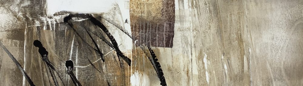
The recent small collagraphs here were influenced by the crumbling facades of buildings I came across in Venice earlier this year. I used scraps of wallpaper, sandpaper, string, muslin and a lovely piece of narrow lace ribbon I picked up at a recent vintage fair, which seems to lend itself well to the suggestion of fine architectural decoration. It also adds to the fun of browsing vintage fairs and the like, looking for textured materials to use.

By the way, I’m sure I’m not the only one to find the used, cleaned plate as interesting in its own right?

Untitled Collagraph, Mari French 2013

Untitled Collagraph, Mari French 2013

Untitled Collagraph, Mari French 2013

Untitled Collagraph, Mari French 2013

Collagraph plate

Collagraph plate, Mari French


Printmaking_corner_of_my_studio.JPG

The printmaking corner of my studio

pressing on …

I finally started using my own tabletop press yesterday in my studio, to produce the first of what I hope will be a series of collagraph prints. As regular readers will know I recently attended one of Laurie Rudling’s excellent workshops, so it was good to be able to put the experience into practice.

My aim is to sell the successful prints at my exhibitions, starting with ‘Beyond the Surface’ in King’s Lynn in September, giving visitors who like my work the opportunity to purchase an original piece at a price most people can afford.

Inking up

In the inking up photo above, you can see I’d been trying out a burnt sienna ink, but didn’t like the results (see bottom photo).

Below is the preferred result, a diptych abstract plate inked up in cerulean blue with a raw umber ‘rub’ over it. The wide angle camera lens unfortunately gives it a wonky look! The original print is actually quite square. 

Untitled collagraph, Mari French 2013

Untitled collagraph, Mari French 2013


Something I think many people (including many artists) are unaware of, is that the inked up collagraph plate usually gives only one print, plus perhaps a ‘ghost print’ – a second print usually quite a bit fainter than the first, but often of interest in itself. This means that each collagraph print has a unique quality; it may be from the same plate but each is different due to the individual inking process involved.

collagraph plate inked in Burnt Sienna

collagraph plate inked in Burnt Sienna


chasing the light …

Two new artworks from my current series ‘Towards the Light’…

See previous posts Towards the Light and Shadow & Light which explain the inspiration for these.

I’m still thinking up a title for the first one below, which I only finished today. That glorious plum colour in the shadows is a glaze using an Inktense block I bought a few days ago, the first time I’ve used them (although I do use the Inktense pencils for sketching).

Untitled.JPG

Untitled, Mari French 2013

I’ve entered the first two of this series (Flight, shown below, and Towards the Light, shown on earlier post) into the National Open Art Competition, so fingers crossed! If they don’t get through I’ll be trying them in other open competitions – I think they’re some of my strongest works.

These are a bit of a departure from my usual landscape work, as regular visitors to my blog and followers of my work will realise. I’m enjoying working on them.

All Acrylic/ink/mixed media on watercolour board, approx 20 x 30 inches.

Flight, Mari French 2013